Gone are the days when a gut-feeling was a major decision-making driver in business. Instinct has ruled business leaders’ mind for a very long time, but as companies expand their business globally, instinct should give way to data as the best measure to remain competitive.
We live in a data-driven world. Today, number-crunching algorithms decide who we should hire, where we should invest and even who we should date. In fact, data-driven organizations that harness insights to create a competitive advantage are growing rapidly—at an average of 30% annually. What’s more, data-driven organizations are on a track to earn $1.8 trillion by 2021.
Data in Businesses
Technology is tucked inside every nook and corner of modern business. Smart leaders use data generated to understand what’s happening in the organization, and this analysis helps them bring agility to their business.
Top companies around the world use data to add value to their business. They gain a strategic advantage over their competitors putting data—not instincts—to good use.
Being data-driven offers multiple advantages:
- Data is the new gold. A long-term relationship with data helps organizations set trends.
- Data-driven decisions offer a better customer experience. Data reveals customer patterns and their journey with products.
- Data-driven organizations respond better to market demands with innovative solutions.
- Data-driven decisions hone key business areas such as finance and operations.
Data offers insights and executives turn those insights into key decisions. But you cannot ignore that fact that data is complex, let alone its analysis. We’re all familiar with excel sheets full of thousands of rows and hundreds of columns of numbers. So, how can this turn into insights? That’s where data visualizations come into action.
Data Visualizations Make Hidden Insights Obvious
Interpreting a voluminous dataset for actionable insights is tough. Data visualizations make voluminous data accessible and comprehensive. How?
Data viz, as it is often called, is the transformation of any unstructured data into visuals. Visuals add a component to human understanding.
For example, the World Bank releases its doing business project data every year, providing insights about countries with conditions for establishing businesses. It was launched in 2002 to measure the regulations applied to various small and medium-size organizations.
A total of 190 economies were surveyed on 12 topics including employing workers, tax benefits and resolving insolvency. A visual summary of data on doing business in 2018 was produced to make these crucial insights digestible for businesses, which then could put them to use.
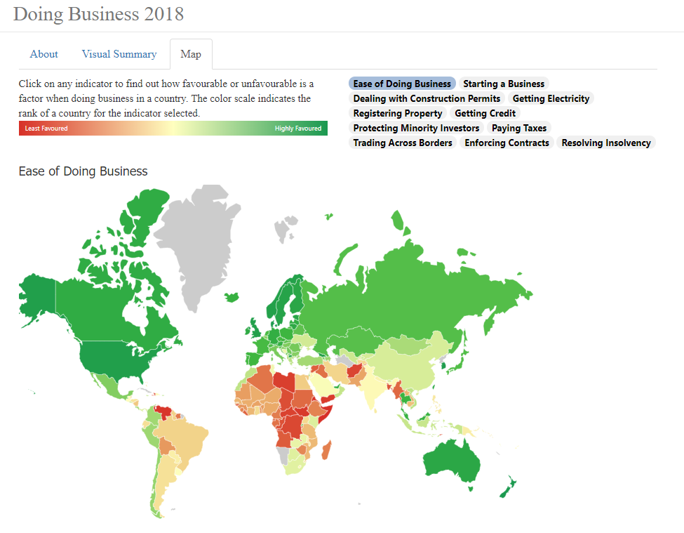
The data science company that created the visualization took the data and plotted it on a world map. It added shades from red to green to indicate the least and the most favored economies for doing business. The data is made easy, appealing and comprehensive. Any business manager or executive can easily identify emerging economies for investment.
Using visual data, insights such as the best and worst country for doing business and economy rankings are now obvious. Furthermore, companies can turn these insights into key decisions regarding expanding business across boundaries.

Take a look at the example above: The United States is an economically powerful country; however, data tells that New Zealand tops the list of economies with ease of doing business in 2018 with 86.55 DTF*. Many countries, including Singapore, Demark, Korean Republic and Hong Kong, also rank favorably in the index.
Three major reasons that data visualization can be crucial for any data-driven organizations are:
- Data visualizations amplify a story with pictures and visuals. Its impact on the audience is more powerful than bland numbers and text. Moreover, human minds are hardwired to remember visuals. Data visualizations tap into pictorial strengths to drive executive decision-making.
- Data visualizations make difficult data comprehensible. Business executives and key decision-makers are not masters in every field. They need comparative measures to drive their decisions. Data visualizations provide just that.
- Data visualizations help in decision analysis. It offers a platform to interact with the facts. Jeff Bezos said that not all the decisions are made by factual analysis. But whichever decisions can be made on facts, should be.
Conclusion
Data should be an influence to any major business decision. And so, data visualization is a powerful tool to bring dramatic changes to organizations. It can provide answers to many key questions, and make the data visually appealing, easy to play with and interesting to explore. CEOs and managers should emphasize the importance of the democratization of their data to add value to their processes.
*DTF: Distance to Frontier. It is a score between zero to one hundred, which illustrates the worst and best performance of an economy observed on each doing business parameter.